Introduction
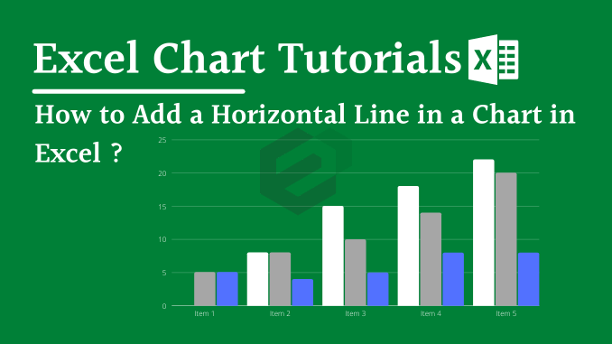
While creating a chart in Excel, you can use a horizontal line as a target line or an average line. It can help you to compare achievement with the target. Just look at the below chart.

Looks awesome, right?
Let’s say you have an average value which you want to maintain in your sales [for example] throughout the year. Or, a constant target that you set for each month which you want to show in a chart for all the months.
In this case, you can insert a straight horizontal line to present that value. This horizontal line can be a dynamic one that will change its value or a line with a fixed value. And in this tutorial blog, we are going to show you exactly how to do this.
We will share how you can insert a fixed as well as a dynamic horizontal line in a chart while working in Microsoft Excel.
Add an Average [Horizontal] Line to a Chart in Microsoft Excel
An average line plays an important role whenever you have to study some trend lines and the impact of different factors on-trend. And before you create a chart with a horizontal line you need to prepare data for it.
Before we jump into the tutorial, let us take a minute and see how the data set is prepared. Here we are using a dynamic chart to show you that how this will help you to make your presentation super cool. Apply this for your own data set to move along.

In the above data tables, we are getting data from the raw table to the dynamic table by using a VLOOKUP MATCH Formula. Every time when we change the year in the dynamic table it will automatically change the sales values and the average will be calculated on those sale figures.
Below are the steps you need to follow to create a chart with a horizontal line.
- First of all, select the data table and insert a column chart.
- Go To Insert ➜ Charts ➜ Column Charts ➜ 2D Clustered Column Chart. or you can also use Alt + F1 to insert a chart.
- So now, you have a column chart in your worksheet like below.

- Next step is to change that average bars into a horizontal line.
- For this, select the average column bar and Go to → Design → Type → Change Chart Type.

- Once you click on change chart type option, you’ll get a dialog box for formatting.
- Change the chart type of average from “Column Chart” to “Line Chart With Marker”.

- Click OK.
Here is your ready-to-rock column chart with an average line and make sure to Download this sample file to work along with this tutorial blog.

Many of our colleagues use this method to add a median line. You can also use this method to add an average line in a line chart. The steps are totally the same, you just have to insert a line chart instead of a column chart. And you will get something like this.

Add a Horizontal Target Line in Column Chart in MS Excel
This is one more method which we often use in my charts is adding a target line. There are several other ways to create a Target Vs. Achievement chart, but target line method is simple & effective. First of all, let us show you the data which we are using to create a target line in the chart.
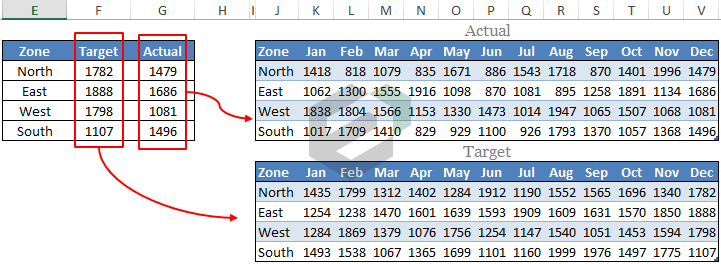
We have used the above table to get the target and actual figures from the month-wise tables and make sure to download the sample file from here. Now let’s start with the steps.
- Select the dynamic table which I have mentioned above.
- Insert a column chart. Go To Insert → Charts → Column Charts → 2D Clustered Column Chart.
- You’ll get a chart like below.

- Now, you have to change the chart type of target bar from
Column Chart to Line Chart With Markers . To change the chart type please use same steps which I have used in the previous method. - After changing chart type your chart will look something like this.

- Now, we have to make some changes in this line chart.
- After that, make a double click on the line to open formatting option. Once you do that, you’ll get a formatting option dialog box.
- Make following changes in formatting.
- Go to → Fill & Line → Line.
- Change line style to “No Line”.
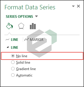
- Now, go to marker section and make following changes.
- Change marker type to Built-In, a horizontal bar, and size 25.
- Marker fill to solid fill.
- Use white color as the fill color.
- Make border style to a solid color.
- And, black color for borders.

- Once you make all the changes to the line you’ll get a chart like I have below.

Congratulations! your chart is ready.

