In this tutorial blog, we will learn about the basic steps to create Histogram in Microsoft Excel along with how to use and when to use Histogram for data visualization and analysis. This tutorial is useful for students, teachers and excel enthusiasts.
Do not forget to download the sample file as you move along with the tutorial blog.
Introduction to Histogram
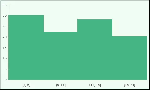
Basically, a histogram is a column or a bar chart that represents values using a range. Example, A class teacher who wants to present marks of students using a category range (Bins).
In the class, she has 50 students and to present the performance of the class, she can use the distribution of students according to their marks using a histogram.
Steps to Make a Histogram in Excel 2016
If you are using Excel 2016 we’ve got good news for you and the good news is, there is an inbuilt option to create a histogram in this version of Excel.
Download Sample File for this tutorial
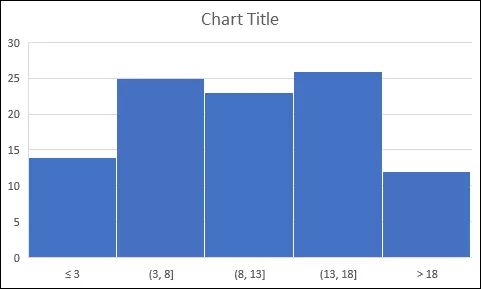
Let’s suppose you have a list of employees and their period of employment with the company. [sample can be downloaded from above link].

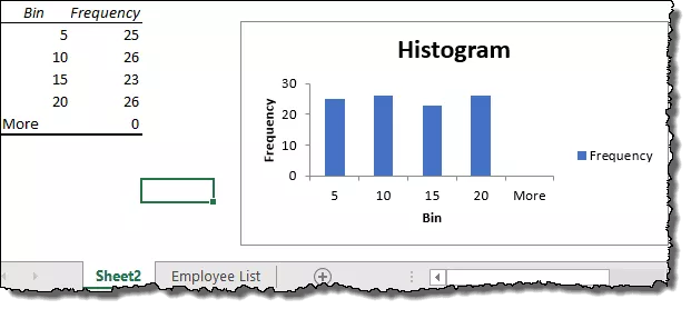
And now you need to create a histogram which should show the number of employees in a particular period range (Bin).
Follow these simple steps:
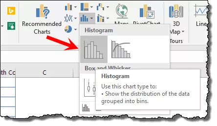
- First of all, select the data and go to the Insert Tab ➜ Charting ➜ Insert Statistic Charts ➜ Histogram ➜ Histogram, to insert the chart.
In reality, this is the only step you need to follow, your chart is there in your spreadsheet.
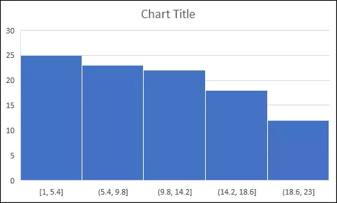
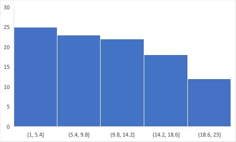
You can delete the chart title and gridlines if you want.
Tip : When you’re using Excel 2016 make sure to convert your data into an Excel table to make it dynamic. So whenever you add new data into it, your chart gets updated automatically.
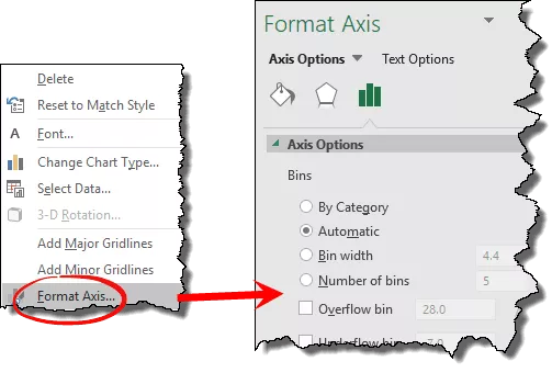
Let’s explore some of the main options related to bins one by one:
- Now, select your chart’s axis and right-click on it and open “Format Axis”
By Categories
If you think about the data we are using here, every entry is unique as each employee’s name is different.
But if you have data where you have repetitive entries, then you can use this option to create a chart based on the SUM or COUNT of those categories instead of numeric bins.
In this case, the bins would be the categories not the distribution of numerical data.
Automatic
When you create a histogram, Excel creates bins automatically using the range of the values you have. In simple words, this option is the default way to make a histogram.
Bin Width
By using this option, you can specify the width of the Bins.
Let’s say if you want to make each bin have 10 then this will create each bin of 0-10, 10-20 and so on.
With this option you have control over the width of the bin and Excel will create the number of bins using width you specified.
Let’s say you have values from 1 to 20 and you want bin width 4, then Excel will create 5 bins like this:

Number of Bin
And if you want to specify the number of bins instead of the range you can click on this option and enter the number.
Let’s say if you want to have 3 bins and the range of values is 0-15 then Excel will create bins like:

Overflow Bin Underflow Bin
These two options help you to create more than or less than bins in the chart.
Let say, you want to have a bin for the employees with a working period of fewer than 10 years.
You can simply enter 10 in the underflow.
Or, if you want to have Bin for the employees having a working period of more than 20 years, enter 20 in the overflow.
Steps to Create a Histogram Chart in Excel 2013 (Data Analysis Tool Pack)
If you are using Excel 2013 or a lower version then you need to follow different steps to create this chart.
There is ADD-IN which you need to install, “Analysis Tool Pack”.
It comes with your Excel but you need to install it…
…so let’s learn to install it (I’m using screenshots for the Excel 2016 but the steps are same in all the Excel versions) and then we’ll get into making a histogram.
Steps to Install Data Analysis Tool Pack
- First of all, click on the file tab and open “Excel Options”.

- Now from here, go to Add-In and open “Excel Add-Ins”.
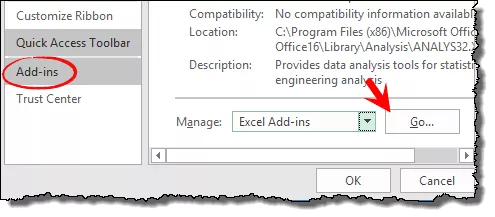
- And, tick-mark the “Analysis Took Pack” and click OK.

Once you click OK, it will process for a few seconds and you’re ready to go. You’ll have a “Data Analysis” button in the Data tab.

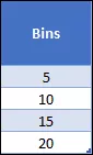
Before you create a histogram using “Analysis Took Pack” you need to create Bins.
Yes, manually. but it’s a simple thing, you know. Here we need bins like below or whatever you want to make.
Now let’s follow these simple steps to insert the histogram and make sure you have this data file with you to follow along.
- First of all, go to the data tab and click on “Data Analysis”.

- Now, from the data analysis menu, select “Histogram” and click OK.

- At this point, you have a histogram window just like below and from this window, you need to specify the following details:
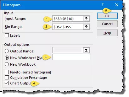
- Input Range: The range where you have employee years with the company (Make sure to only select the values without heading).
- Bin Range: The range where you have bins, yes the one we have just created (Make sure to only select the values without heading).
- Output Option: Select the “New Worksheet” for the output and tick mark the “Chart Output” for the chart.
- In the end, click OK.
Once you click OK you’ll have a new worksheet with a chart and a frequency.