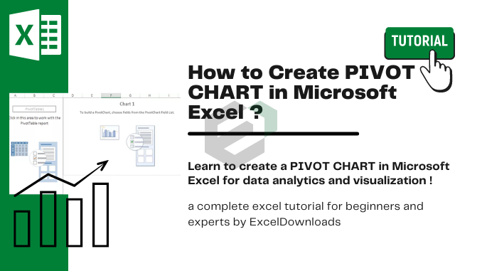
Introduction to PIVOT Charts
Data in a visual way not only helps the user to understand it but it also helps you to present a clearer picture of it and you can make your point clear with led efforts. And when we talk about Excel, there are numbers of charts which you use but there’s one of all those that STANDS OUT and that’s a PIVOT CHART.
What are Pivot Charts ?
Pivot Chart is the best type of graphs for the analysis of data. The most useful feature is the possibility of quickly changing the portion of data displayed, like a PivotTable report. It makes Pivot Chart ideal for presentation of data in the sales reports.
Difference a Pivot Chart and a Normal Chart
- A standard chart use range of cells, on the other hand, a pivot chart is based on data summarized in a pivot table.
- A pivot chart is already a dynamic chart, but you have to make changes in data to convert a standard chart into a dynamic chart.
Download Sample File
Download SAMPLE EXCEL FILE to move along with this tutorial.
Steps to Create a Pivot Chart in Excel
You can create a pivot chart by using two ways. One is to add a pivot chart in your existing pivot table, and other is to create a pivot chart from scratch.
1. Create a Pivot Chart from Scratch
Creating a pivot chart from scratch is as simple as creating a pivot table. All you need, a data sheet.
Here I am using Excel 2013 but you use steps in all versions from 2007 to 2016.
- Select any of the cells in your data sheet and go to Insert Tab → Charts → Pivot Chart.

- The pop-up window will automatically select the entire data range and you have the option to choose the place where you want to insert your pivot chart.

- Click OK.
- Now, you have a blank pivot table and pivot chart in a new worksheet.

Important Note: When you insert a pivot chart it will automatically insert a pivot table along with it. And, if you just want to add a pivot chart, you can add your data into Power Pivot Data Model.
- In pivot chart fields, we have four components like we have in a pivot table.
- Axis: Axis in pivot chart is as same as we have rows in our pivot table.
- Legend: Legend in pivot chart is as same as we have columns in our pivot table.
- Values: We are using quantity as values.
- Report Filter: You can use report filter to filter your pivot chart.

- So, here is your fully dynamic pivot chart.

2. Create a Pivot Chart from Existing Pivot Table
If you already have a pivot table in your worksheet then you can insert a pivot chart by using these simple steps.
- Select any of the cells from your pivot table.

- Go to Insert Tab → Charts → Pivot Chart and select the chart which you want to use.

- Click Ok.
It will insert a new pivot chart in the same worksheet where you have your pivot table. And, it will use pivot table rows as axis and columns as the legend in pivot chart.
Important Note: Another smart and quick way is to use shortcut key. Just select any of the cells in your pivot table and press F11 to insert a pivot chart.
More Information about Pivot Charts
Managing a pivot chart is simple and here is some information which will help you do it smoothly.
1. Change Chart Type
When you enter a new pivot chart, you have to select the type of the chart which you want to use. And, if you want to change the chart type you can use following steps for that.
- Select your pivot chart and go to Design Tab → Type → Change Chart Type.

- Select your favorite chart type.
- Click OK.
2. Refresh a Pivot Chart
Refreshing a pivot chart is just like refreshing a pivot table. If your pivot table is refreshing automatically, then your pivot chart will also update along with that.
Method-1
- Right-click on your chart.
- And then click on pivot chart options.

- Go to data tab and tick mark “Refresh data when open a file”.

- Click OK.
Method-2
Use below VBA code to refresh all kind of pivot tables and pivot chart in you workbook.
Sub auto_open()
Dim PC As PivotCache
For Each PC In ActiveWorkbook.PivotCaches
PC.Refresh
Next PC
End Sub
Apart from above, code you can use following VBA code if you want to refresh a particular pivot table.
Sub auto_open()
ActiveSheet.ChartObjects("Chart 5").ActivateActive
Chart.PivotLayout.PivotTable.PivotCache.Refresh
End Sub
3. Filter a Pivot Chart
Just like a pivot table, you can filter your pivot chart to show some specific values. One thing is clear that a pivot table and pivot chart are connected with each other.
So, when you filter a pivot table, your chart will automatically filter.
And, when you add any filter in your pivot table it will automatically add into your pivot chart and vice versa.
Please follow these steps for this.
- Right click on your pivot chart and click on “Show Field List”.

- In your pivot chart field list, drag fields in the filter area.

Important Note: By default, you have filter option at the bottom of your pivot chart to filter axis categories.
4. Show Running Total in a Pivot Chart
In below pivot chart, we have used a running total to show the growth throughout the period.

To enter a running total in a pivot chart is just like entering a running total in a pivot table. But we need to make some simple changes in chart formatting.
- From your pivot chart field list, drag your value field twice in value area.

- Now, in second field value open “Value Field Settings”.
- Go to “show value as” tab and select running total from the drop down.

- Click OK.
So here is your pivot chart with running total but one more thing which we have to do to make it perfect.
- Select you primary axis and change values as per your secondary axis.

5. Move a Pivot Chart to New Sheet
Like a standard chart, you can move your Excel pivot chart to a chart sheet or any other worksheet.
To move your pivot chart.
- Select your chart and right click on it.
- Click on move chart and you will get a pop-up window.

- Now, you have two different options to move your chart.
- New Chart Sheet.
- Another Worksheet.
- Select the desired option and click OK.
You can also move your chart back to the original sheet using same steps.
Other tips for working on Pivot Charts
Some of extra tips to make a better control over it.
1. Using a Slicer with a Pivot Chart to Filter
As We have already mentioned, you can use a slicer with your pivot chart.

And, the best part is that you can filter multiple pivot tables and pivot charts with a single slicer. Follow these steps.
- Select your pivot chart and go to Analyze Tab → Filter → Insert Slicer.
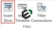
- Select the field which you want to use as a filter.

- Click OK.
Using a slicer is always a better option is than a standard filter.
2. Insert a Timeline to Filter Dates in a Pivot Charts
If you want to filter your pivot chart using a date field then you can use a timeline instead of a slicer.

Filtering dates with a timeline is super easy.
This is like an advanced filter which you can use to filter dates in term of days, months, quarters and years.
- Select your pivot chart and go to Analyze Tab → Filter → Insert Timeline.

- Select your date field from the pop-up window and it will show you fields with dates.
- Click OK.
3. Present Months in a Pivot Chart by Grouping Dates
Now, let’s say you have dates in your data, and you want to create a pivot chart on month basis.
One simple way is to add a month column in your data and use it in your pivot chart.
But, here is the twist.
You can group dates in your pivot table which will further help you to create a pivot chart with months even when you don’t have months in source data.
- Go to your pivot table and select any of the cells from your date field column.
- Right-click on it and select group.

- Select the month from the pop-up window and click OK.
Conclusion
A Pivot Table is used to summaries, sort, reorganize, group, count, total or average data stored in a table. It allows us to transform columns into rows and rows into columns. It allows grouping by any field (column), and using advanced calculations on them.
Thus, one should learn and master the functionalities in Microsoft Excel when it comes to using PIVOT Charts so that you can analyze your data at the optimum level.