Introduction to Funnel Charts in MS Excel
The best way for you to track your sales is to use a funnel chart. A sales funnel chart not only describes the stages of the process but also provides a conversion funnel for your new business.
And in today’s post, I’m going to show you the exact steps which you can use to create sales funnel chart in Excel. Well, not just sales you can use this funnel chart in any process.
And now, let’s get started.
Download Tutorial Sample Data
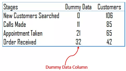
You have the following data table for this chart template which you can download from here to follow along.
Steps To Create a Sales Funnel Chart in Excel

- First of all, insert a dummy data column.

- In cell B2, insert the below formula into the formula bar and drag it down.
=(MAX($I$4:$I$7)-I4)/2
- To set up sales funnel just select the data and insert a stacked bar chart.
- Now, you have a chart like this.

- From here, we need the following customization to transform this chart into a sales funnel chart.
- Now, select the vertical axis and change the category in reverse order. Format Axis → Axis Options → Axis Position.
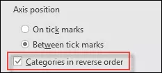
- After that, select the data bar for dummy data and remove fill color and border from it.
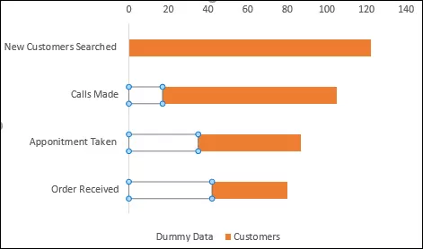
- In the end, select data bars and change gap width to 0%. Format Data Series → Series Option → Gap Width.
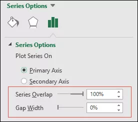
- And now, you have a neat and clean funnel chart to use as a template.

- Congratulations! your funnel chart is ready now.
Funnel Chart Using REPT Function
As we earlier said that there is a feature called in-cell charting. Let us show you how you use the REPT function to create a sales funnel template in Excel. Creating an in-cell sales funnel chart is simple and quick, here are the steps.
- Take data in a simple form, you can use the sample data above.

- In the blank column, enter below formula and drag it down.
=REPT(“|”,D4/2)
- And now, change the text alignment to the center for bars.

- Your in-cell funnel chart is ready.
Conclusion for this tutorial blog
Using a sales funnel chart is one of the best ways of tracking a sale process. You can also add additional things in a chart as well, like conversion rate, pending percentage, etc.
All the steps which you have used above are simple and easy to follow. And, if you don’t want to put efforts you go with an in-cell version, as show in the above tutorial.


