In this blog post, you will learn how to create and customize milestone charts in Microsoft Excel. The Milestone chart, as the name suggests, is useful in showcasing the visualization of the project timelines and achievements as on date. Project managers and business managers use this chart extensively for management reporting and timeline tracking.
Introduction to Milestone Charts
Tracking all the steps of a project is an important task. You know this, right It’s as important as the execution of each step. In fact, tracking makes execution easy.
In Excel, one of the simplest yet power charts which you can use to track your projects is a MILESTONE CHART. They also call it the “Timeline Chart”.
It’s one of the favorite project management tools of Experts. It visually shows a timeline where you can specify key milestones, deliverable, and other checkpoints.
According to Wikipedia: Milestones are tools used in project management to mark specific points along a project timeline.
The basic idea in a milestone chart is to track each step of your project on a timeline with its completion date and present it in a simple way.
Today in this post, we would like to share with you a simple 3 steps process to create a milestone chart in Excel.
So let’s get started.
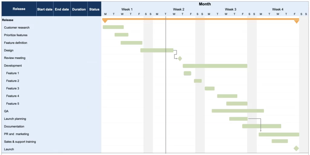
This tutorial is helpful for excel users of any version. Furthermore, you can also explore our Gantt Chart templates and Project Management excel dashboards for quick references.
Benefits of Using a Milestone Chart
Before we get into it, let me tell you some core benefits of using a milestone chart.
- It’s easy to check the progress of the project with a milestone chart.
- Easy for the user to understand the project scheduling.
- You have all the important information in a single chart.
Download the sample data
Download Sample File to move along with the tutorial so that you can master the skill to create a milestone chart in Microsoft Excel.

Steps to Create a Milestone Chart in Excel
I have split the entire process into three steps to make it easy for you to understand.
1. Set Up Data
You can easily set up your data for this chart. Make sure to arrange your data like below data table.
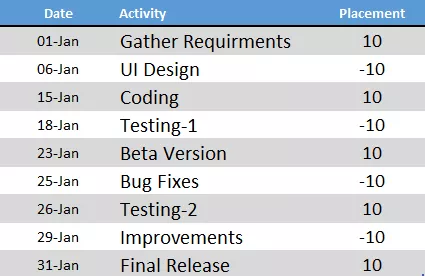
In this data table, we have three columns.
- The first column (Date) is for completion dates of the project stages. And, make sure the format of this column should be text format.
- The second column (Activity) is for activity name.
- The third column (Placement) is just for placement of the activities into the timeline (up and down).
2. Insert a Chart
Now here’s the game starts. Creating a milestone chart is a bit lengthy process but it’s worth for this amazing chart.
Here are the steps.
- Select any of the cells from the data.
- Go to Insert Tab ➜ Charts ➜ Line With Markers.
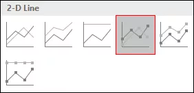
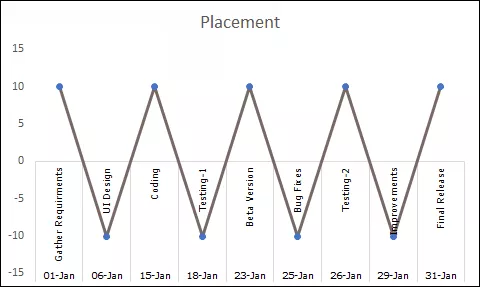
- We’ll get a chart like this. But, this is not what we want, we have to re-create it.
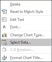
- So now, right click on the chart and then go to “Select Data”.
- In select data window, just remove series from legend entries.
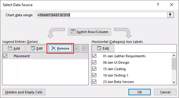
- Now, our chart is totally blank. So, we have to re-assign series and axis labels.
- Click on “Add” from legend entries.

- In edit series window, enter “Date” in the series name and select activity column for the series values.

- After that, click on edit in “Horizontal Axis Labels” and refer to the date column and click OK.
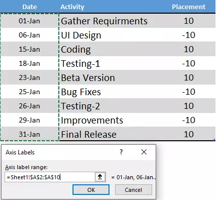
- Next, we have to insert an another series. Click on “Add” in legend entries and name it “Placement” and refer series values to placement column.
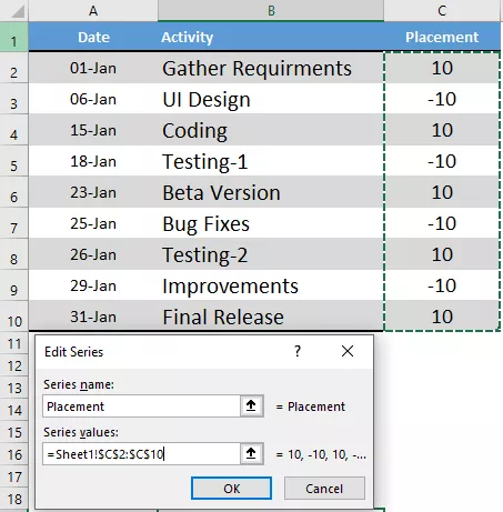
- Now, just click OK.
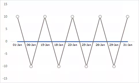
At this point, we have a chart which looks like a timeline. But we need a small touch of formatting to make it a perfect milestone chart.
3. Final formatting
A small touch of formatting.
Just follow these simple steps.
- Click on the line chart and open formatting option.
- For line, use “No Color”.
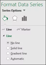
- With the same selection, go to Design Tab -> Add Chart Element -> Error Bars -> More Error Bars Options.
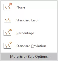
- Now, from the formatting options, select direction “Minus” and error value “Percentage: 100%” for error bars.

- After that, convert your line chart into secondary axis and instantly delete the secondary axis.
Now, the last and important thing you have to do, add the activity name for each step.
- First of all, add data labels.
- Now, from data label formatting options, select “Category Name”.
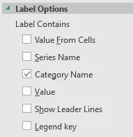
- After that, select your chart and click on “Select Data”.
- Click on “Placement” series.

- From axis label, click on edit and refer to activity column.

- Click OK.
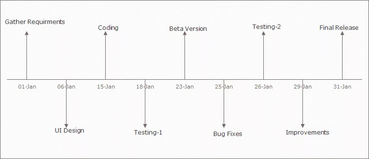
Final Conclusion
Milestone chart is easy to understand for the end-user and you can track your project scheduling in a simple way. It looks a bit tricky when you are making it for the first time but, if you are an emerging project manager then it’s just for you to give it a try.


