Whenever you create a chart and when you make some changes around the source data, you need to manually change or select the range of the source. Well, dynamic chart range solves that problem while working in Microsoft Excel (any version latest). In this blogpost, we will learn about dynamic chart range and how to configure it. Stay Tuned !!
Why dynamic chart range is essential ?
Oh ! Forgot to mention earlier, even when you delete some data, you have to change its range.
Maybe it looks like that changing a chart range is no big deal. But what, when you have to update data frequently?
You do need a dynamic chart range.
Now, Download SAMPLE FILE to learn the process with us.
How can one be so sure of its need ?
Firstly, let us show you something.

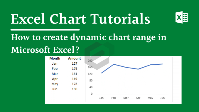
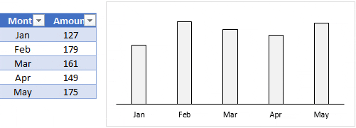
Above, you have a chart with the month-wise amount and when you add the amount for Jun Month, chart values are the same, there is no change. Now the thing is, you have to update the chart range manually to include Jun in the chart.
So what do you think, using a dynamic chart range is a time-saver or not ? Now, Let us understand in detail, how to create the dynamic range for our visualization so that we don’t have to deal with non-updated charts and graphs in excel.
Using Data Table for Dynamic Chart Range
If you are using the 2007 version of excel or above then using a data table instead of a normal range is the best way.
All you have to do, convert your normal range into a table (use shortcut key “Ctrl + T”) and then use that table to create a chart. Now, whenever you add data to your table it will automatically update the chart as well.
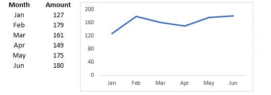
In the above chart, when we have added the amount for Jun Month, the chart gets updated automatically. The only thing that leads you to use the next method is when you delete data from a table, your chart will not get updated.

The solution to this problem is when you want to remove data from the chart just delete that cell by using the delete option.
Using Dynamic Named Range in MS Excel
Using a dynamic named range for a chart is a bit tricky but it’s a one-time setup. Once you do that, it’s super easy to manage it. So, I have split the entire process into two steps.
Creating a dynamic named range.
To create a dynamic named range we can use OFFSET Function.
Quick Intro to Offset: It can return a range’s reference which is a specified number of rows and columns from a cell or range of cells. We have the following data to create a named range.

In column A we have months and amounts in column B. And, we have to create dynamic named ranges for both of the columns so that when you update data your chart will update automatically.
Here are the steps.
- Go to Formulas Tab -> Defined Names -> Name Manager.

- Click on “New” to create a named range.

- Now, in the new name window, enter the following formula (I will tell you further how it work).
=OFFSET(Sheet2!$B$2,0,0,COUNTA(Sheet2!$B:$B)-1,1)
- Name your range “amount”.

- Click OK.
- Now, create another named range by using following formula.
=OFFSET(Sheet2!$A$2,0,0,COUNTA(Sheet2!$A:$A)-1,1)
- Name it “month”.
- Click Ok.
At this point, we have two named ranges, “month” & “amount”. Now, let us tell you how it works. In the above formulas, We have used the count function to count the total number of cells with a value. Then We have used that count value as a height in offset to refer to a range.

In the month range, we have used A2 as starting point for offset and counting the total number of cells having in column B with COUNTA (-1 to exclude heading) which gives reference to A2:A7.
Changing source data for the chart to dynamic named range
Now, we have to change source data to named ranges we have just created. Oh, We are sorry We forgot to tell you to create a chart, please insert a line chart. Here are the further steps.
- Right click on your chart and select “Select Data”.

- Under legend entries, click on edit
![]()
- In series values, change range reference with named range “amount”

- Click OK.
- In horizontal axis, click edit.
![]()
- Enter named range “months” for the axis label

- Click Ok.
All is done. Congratulations, now your chart has a dynamic range.
Conclusion
Hence, in this blogpost we have learned the tutorial on Dynamic Chart Range in Excel. This will help you create the visualization or chart in one Go and play around with the data table or data range. This is very useful when you are dealing with periodically changing data. Explore other Chart and Graphs tutorials and tips in Excel.