What is a Step Chart ?
A step chart is a perfect chart if you want to show the changes happened at irregular intervals. And that’s why it’s a part our advanced charts list. It can help you to present the trend as well as the actual time of a change. In reality, a step chart is an extended version of a line chart.

Unlike the line chart, it doesn’t connect data points using a short distance line. In fact, it uses vertical and horizontal lines to connect the data points. Now the bad news is: In Excel, there is no default option to create a step chart. But, you can use some easy to follow steps to create it in no time.
So today, in this post, I’d like to share with you a step by step process to create a step chart in Excel. And, you will also learn the difference between a line chart and a step chart which will help you to select the best chart according to the situation.
Line Chart Vs. Step Chart
Here we have some differences between a line chart and a step chart and these points will help you to understand the importance of a step chart.
Exact Time of the Change
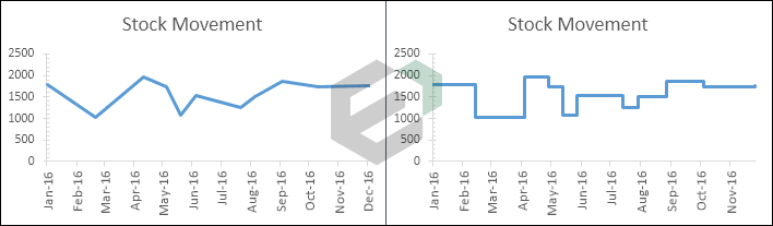
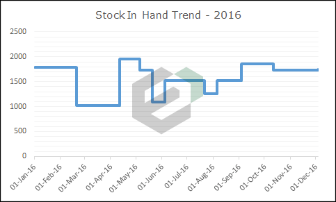
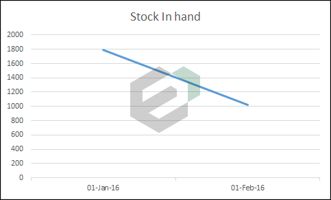
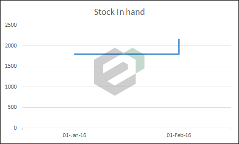
A step chart can help you to present the exact time of a change. On the other hand, a line chart is more concerned about showing trends instead of the change. Just look at the below two charts where we have used stock in hand data.
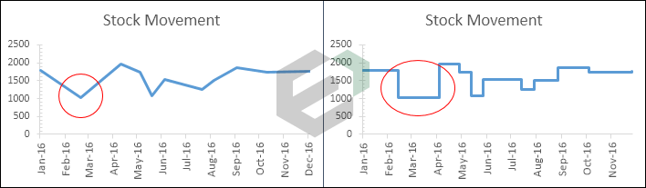
Here, the line chart shows a decrease in stock from Feb to Mar. And for the same period, in step chart, you can see that the increase has only happened in April. In short, in a line chart, you can’t see the magnitude of a change but in a step chart, you can see the magnitude of a change.
Actual Trend
A step chart can help you to show real insight into a trend. On the other hand, a line chart can be misleading sometimes. Below, in both of the charts, you have a decrease in stock in May and then again increase in Jun.
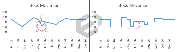
But, if you look at both of the charts you will find that the trend of decrease, and then an increase is not clearly shown in the line chart. On the other hand, in the step chart, you can see before the increase there is a constant period.
Constant Periods
A line chart is not able to show the periods where the values were constant. But in the step chart, you can easily able to show the constant time period for values. Look at both charts.
In the step chart, you can clearly able to see there is always a constant period before any increase and decrease. But, in the line chart, you can only see the points where you have a decrease or an increase.
Actual Number of Changes
In the below two charts, an increase has occurred between Jul to Aug and then Aug to Sep. But, if you look at the line chart, you are not able to clearly see both of the changes.
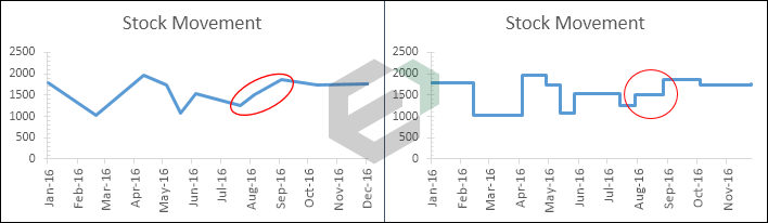
Now, if you come to the step chart, it is clearly shown that you have two changes between Jul to Sep. I am sure all the above points are enough to convince you to use a step chart instead of a line chart.
Simple Steps to Create a Step Chart in Excel
Now, it’s time to create a step chart and for this, we need to use the below data here to create this chart.
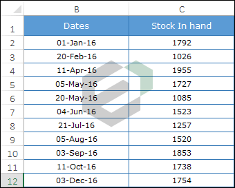
It’s stock in hand data of various dates where increase and decrease happened in stock.
You can download this file from here to follow along.
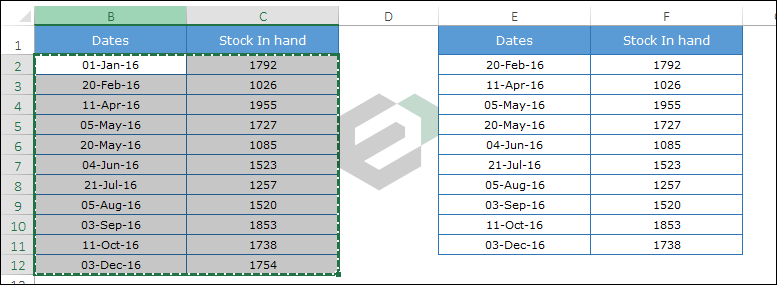
- First of all, you need to construct data in a new table by using the following method. Copy and paste headings in new cells.
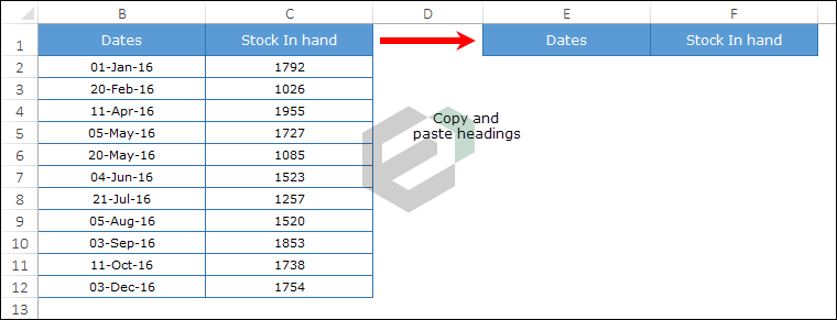
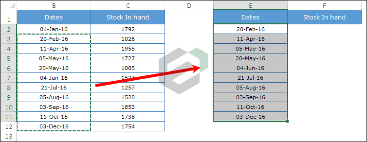
- Now from the original table, select dates starting from the second date (A3 to A12) and copy them.
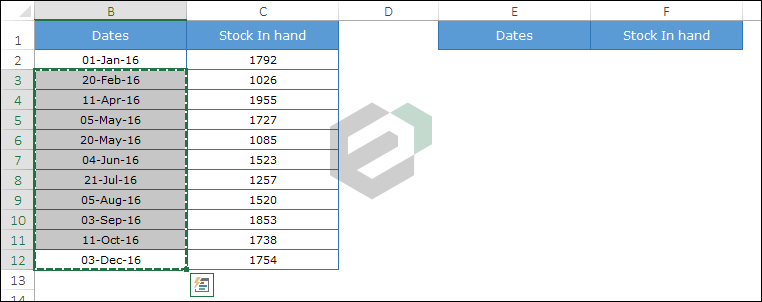
- After that, go to your new table and paste dates below the “Date“ heading (to D2).
- Again, go to your original table and select stock values from the first value to the second-last value (B2 to B11) and copy it.
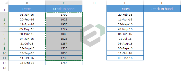
- Now, paste it below the “Stock in Hand” heading, parallel to the dates (paste to E2).
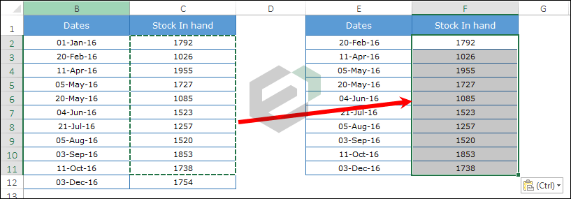
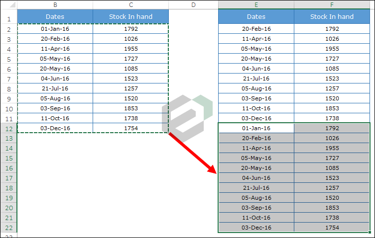
- After that, go to your original data table and copy it.
- Now, paste it below the new table which you have just created. and now, your data will look something like this.
- In the end, select this data table and create a line chart. Go to data tab -> Insert ➜ Charts ➜ Line Chart ➜ 2-D line chart.
Congratulations! your step chart is ready to rock.
How does it works?
I am sure that you are happy after creating your first step chart. But, it’s time to understand the whole concept that you have used here. So let’s take an example with a small data set.
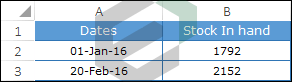
In the below table, you have two dates, 01-Jan-2016 and 20-Feb-2016 and you have an increase in stock on 20-Feb-2016.
With this data, if you create a simple line chart, it will look like this.
Now backtrack a little bit and remember what you have learned earlier in this post. In a step chart, an increase will only show when it has actually happened. So, here you need to show the change in Feb instead of a trend line from Jan to Feb.
For this, you need to create a new entry for 20-Feb-2016 but with the stock value of 01-Jan-2016. This entry will help you to show the line when the increase has not happened. So, when you create a line chart with this data it will become a step chart.
How to Create a Step Chart without Dates in MS Excel ?
While creating a step chart for this post, I have found that the line chart has a small plus point over the step chart.
Just think like this, most of the time or almost every time you use a line chart to show trends. And, trends are always related to dates and other time measurements.
When you create a line chart, you can use months or years (without dates) to the present time period. But when you try to create a step chart without dates it will look something like below.
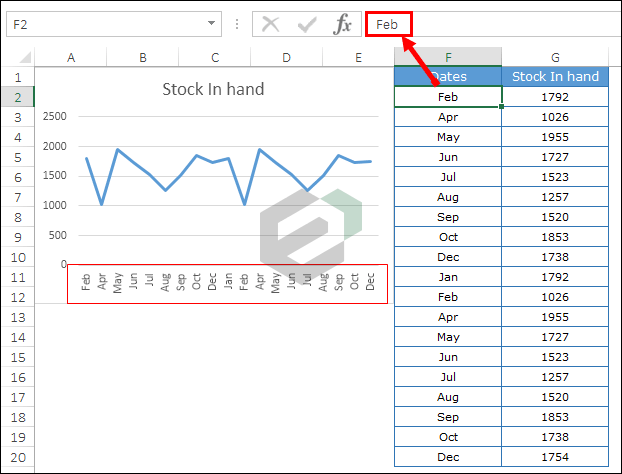
Here, instead of combining dates, Excel has separated months in two different parts. First, Jan – Dec and then second Jan-Dec.
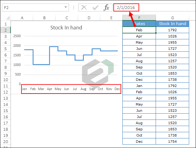
Now, it’s clear that you can’t create a step chart if you use text instead of dates. Well, I don’t mean that because I have a solution for this. Whenever you have months or years, just convert them into a date.
For example, instead of using Jan, Feb Mar, and so on, use 01-Jan-2016, 01-Feb-2016, 01-Mar-2016 and get a month from dates using custom formatting.
Like this.
And, that just create your step chart.
PROBLEM SOLVED.
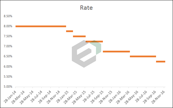
How to Create a Step Chart without Risers in MS Excel ?
First of all, I want to thank, Jon Peltier for this amazing idea to create a step chart without risers. In this chart, instead of a complete step chart, you will only have the lines where the value is constant.
The best use of this chart is when your values are increasing or decreasing after a constant period. For example, home loan rates, bank interest rates, etc.
Steps to Create a Step Chart without Risers
To create this chart we need to construct data the same as you have done for a normal step chart. Download this sample data file from here to follow along.
Step-1: First of all, we need to construct a table for this.
- Copy and paste headings in new cells.
- Now from the original table, select dates starting from the second date (A3 to A12) and copy it.
- After that, go to your new table and paste dates below the “Date“ heading (to D2).
- Again, go to your original table and select stock values from the first value to the second last value (B2 to B11) and copy it.
- Now, paste it below the “Interest Rate” heading, parallel to the dates (paste to E2).
Step-2: Now, copy dates from first to last and paste it below the new data table. Don’t worry about blank cells for the rate.
Step-3: After that, once again copy your original data table and paste it below the new data table. Here you have your data in three sets like this.
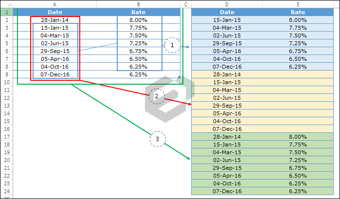
Step-4: Select the data and create a line chart with it.
Boom! your step chart without risers is ready.
Sample File
Download all the sample files from here
Conclusion
As you have learned above that a step chart is an advanced version of a line chart. It will not only show you trends but some important insights which are hard to get with a line chart.
Maybe it looks a bit tricky at first sight but once you get handy with the construction of the data you can create it within seconds.
Now, tell us one thing.
What do you think which chart is more useful Step Chart or Line Chart?