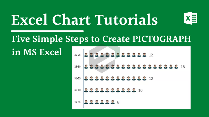
In this tutorial blog by ExcelDownloads, we will discuss about Pictograph, how we can create one for our data series using Microsoft Excel and how to customize it as per our need.
Understanding Pictograph
A pictogram, also called a pictogram, pictograph, or simply picto, and in computer usage an icon, is a graphic symbol that conveys its meaning through its pictorial resemblance to a physical object
Background
If you know how to present data in an understandable and effective way, you can deliver your message strongly. For this purpose, one of my favorite things is a PICTOGRAPH. And in Excel, creating a pictograph is quite simple and easy.

Today in this post, We’d like to share with you a simple step by step process to create a pictograph in Excel. Here my idea is to present the number of employees from various age groups in a company.
Now without any further ado, let’s get started.
Sample File for the Tutorial
Before we begin, pls DOWNLOAD THE SAMPLE FILE to get along with the tutorial.
Simple Steps to Create a Pictograph in Excel
As we said it’s the total employees in a company age wise and we need to present these groups using this chart.
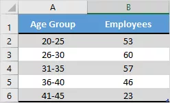
- First of all, just select your data to create a bar chart. For this, go to Insert ➜ Charts ➜ 2-D Clustered Bar Chart.
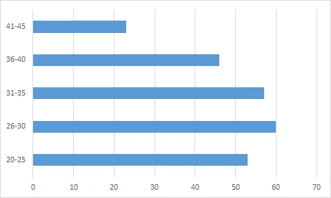
- After that, select the data bars in the chart and go to Right Click ➜ Format Data Series Option.
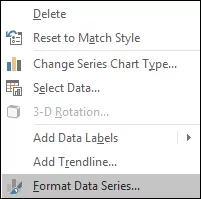
- From here, go to “Fill” section and select “Picture or Texture Fill” option and once you do this, you’ll get an insert picture option.
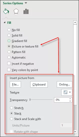
- Now it’s time to insert the picture and we have three options for this. Click on the “File” option and upload the image you have downloaded.
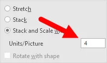
- Once you insert the image, you have further three options to show that picture in the chart. [Select the third option]
- Stretch – A single image will stretch in data bar.
- Stack – You will get stacked images in the data bar.
- Stack and Scale with – Images will be shown as per data.
Hurray! our chart is ready to rock.
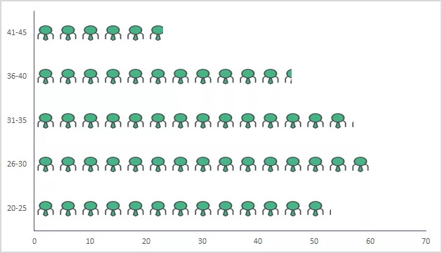
Note: There is an option to specify unit/picture for the chart. You can use it if the values per bar in your chart are large (more than 20). The thing is that the picture icons will become smaller with more numbers and this option helps in that case.
You can also use a different picture for different bars, just like I have used in the below chart.

Select each data bar separately and insert a picture one by one for all the bars.
Dynamic Pictograph in Excel
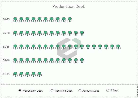
We always love to create interactive charts and for this time we want to convert this PICTOGRAPH into a chart in which we can use data in an dynamic way. Just like below.

Look at the below data where we have same company’s employees data, but department wise and we need to create a dynamic chart here which we can operate with option button.

You can quickly create the data set like the above one as per your requirement, to follow along and now use below steps to create a dynamic pictograph.
- First of all, create a different table with two columns, just like I have below.

- Now, insert four option buttons in your worksheet. For this go to Developer Tab ➜ Controls ➜ Insert ➜ Option Button.
- After that, connect those option buttons with a cell. In my case I’m connecting them with cell A8.
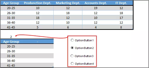
- Since we need to control data (department wise) with option buttons make sure to name all the buttons according to the department name.
- From here, insert below formula into the first cell (heading) to last cell of the second column of the new table.
=VLOOKUP(A9,A1:E6,$A$8+1,0)
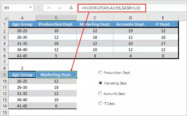
- At this point, we have a dynamic table where we can get data by using option buttons.
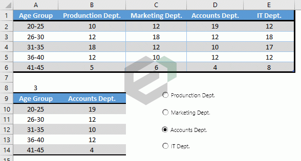
- In the end, select this table and insert a bar chart and convert it into a pictograph using the steps you have learned.
Hurray! our dynamic pictograph is here.
Conclusion
A pictograph uses picture symbols to illustrate statistical information. It is often more difficult to visualize data precisely with a pictograph. This is why pictographs should be used carefully to avoid misrepresenting data either accidentally or deliberately.
Now, that you have the complete tutorial in hand, and also probably practiced yourself on how to create one with the demo tables and data set, you can quickly start drafting Pictograph for your own data set and impress the audience. You can also copy the graph and showcase in your PowerPoint Presentations as well. Create visually appealing presentations in PowerPoint with free presentation templates.

