A box plot template or box and whisker plot is made in Excel using the new built-in Box and Whisker chart for Excel 2016 or later. To create your own chart, you’ll need to use a couple of tricks. First, the box using stacked column charts. Second, the whisker using y-error bars. Excel provides built-in functions you need to calculate the quartiles used for the “box” part of the box and whisker plot.
Why Use a Box and Whisker Plot?
Box and whisker plots are very effective and easy to read, as they can summarize data from multiple sources and display the results in a single graph. Box and whisker plots allow for comparison of data from different categories for easier, more effective decision-making.
About Box and whisker plot calculator excel template
Create a box plot quickly and easily. Enter your data into the Data sheet and the chart in the Plot worksheet will update automatically.
Limitation of this box plot excel template
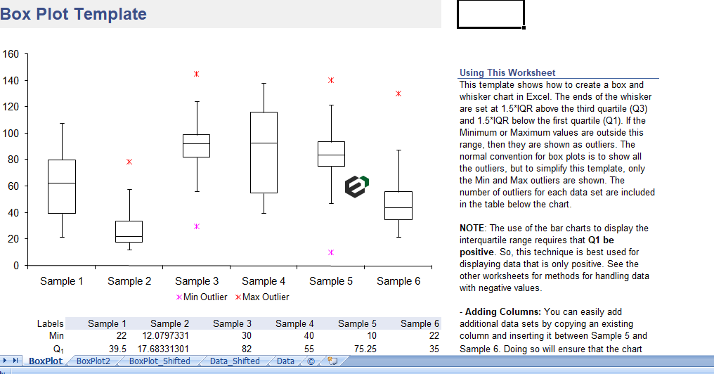
This template shows only the maximum or minimum outliers, if there are any. Normal convention for box plots is to show all outliers. Certainly, To show all outliers, you can use the new Box and Whisker Chart that is a new built-in chart type in Excel 2016 or later (see the template below).
Regarding Negative Values in the template
Using bar charts to display the interquartile range limits the technique described below to displaying positive values. There are a couple ways around this problem and both of these alternate methods including additional worksheets in the file.
(1) You can shift the data so that it is positive before creating the box plot and
(2) you can avoid the use of bar charts and display Q1, Q3, and the Median using series markers instead.
Creating a Box and Whisker Plot
Mostly, Box plots are very useful data visualization tools for depicting a number of different summary statistics. for graphically comparing multiple data sets. It is much easier to create these plots in Excel if you know how to structure your data.
1. Creating the Box
The box part of a box and whisker plot represents the central 50% of the data or the Interquartile Range (IQR). The lower edge of the box plot is the first quartile or 25th percentile. The upper edge of the box plot is the third quartile or 75th percentile.
The location of the median line relative to the first and third quartiles indicates the amount of Skewness or asymmetry. If the distribution is symmetric, the median is exactly in the middle. if the median is closer to Q3, the distribution is negatively skew. If the median is closer to Q1, the distribution is positively skew.
The plot in Excel creates using a stacked column chart with 3 series. Actually, the first series (bottom column) is Q1 and the border and area properties are set to none ,the column is not visible in the chart. The second series is Q2-Q1. The third series is Q3-Q2. These two series, stacked together make up the interquartile range. The area property is set to none for these two series to create just the outline for the box.
2. Creating the Whisker
Certainly, The whiskers in a plot represent the tails of the distribution. The whiskers can be created using error bars in Excel. Because of the ease of calculation, the convention for the length we use in the box plot template:
- The upper whisker starts at Q3 and extends upward to Q3+1.5(IQR) or the maximum value, whichever is lower.
- The lower whisker starts at Q1 and extends downward to Q1-1.5(IQR) or the minimum value, whichever is greater.
However, Another common convention is that instead of extending the whisker to a calculated value of Q3+1.5(IQR). The whisker extend to the last data point that is less than or equal to Q3+1.5(IQR), and similarly with the lower whisker.
In the box plot template, the whiskers is create adding Y-error bars to series 1 (Q1) and series 3 (Q3-Q2).
Download and use box plot calculator diagram excel template
Now, let us look into how to use this Box Plot calculator diagram excel template. You should have Microsoft Office/ Microsoft Excel installed in your system.
Post installing Excel or Spreadsheet, download the zip file of this template, extract the template using WinRAR or 7Zip decompressing software. Once extracted, you can open the file using Excel and start entering data or customizing the template. You can change currency and fields but with caution.