We all have heard and used filters while analyzing data set in Microsoft Excel, right ? What if You want to enhance your filtering and analzying part – Sounds amazing ?
SLICER tool in Excel is the great option. Slicer makes your data filtering experience a whole lot better.
It’s fast, powerful, and easy to use.
Understanding SLICER in Excel
In Microsoft Excel, a slicer is a visual tool that provides an interactive way to filter and analyze data in pivot tables and pivot charts. It’s particularly useful when working with large datasets and allows users to quickly filter and focus on specific data subsets without having to modify the underlying pivot table structure. Slicers provide a user-friendly interface for data filtering, making it easier to analyze and present data in a dynamic and intuitive manner.
Insert Slicer with a Table in Excel
Now that we have understood what is a SLICER tool and how it can help us in advanced filtering and dashboard prepartion, Let’s understand how to insert SLICER in our data table. To insert a SLICER in an Excel Table use the following steps.
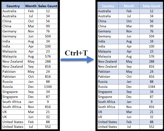
- Firstly, press CTRL+T to convert the data table (normal table) into an Excel table, or you can also go to the Insert tab and click on the table. The visual appearance of normal data table and Excel Table is a bit different. Refer the screenshot below;
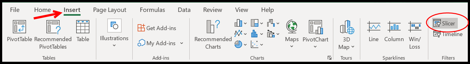
- After that, select any of the cells from the table and then Go to → Insert Tab → Slicer (click on the slicer button). Refer the screen below for what to do;

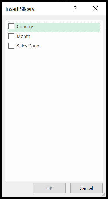
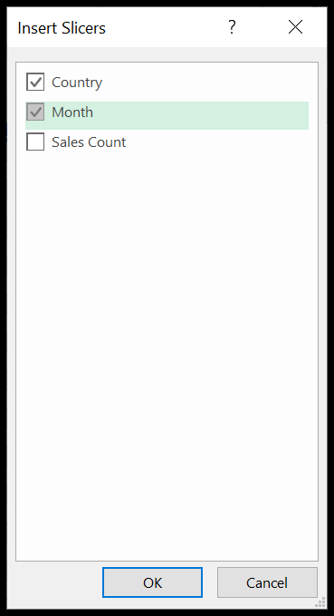
- Once you click on the button you have a dialogue box with all the columns names to select out them to insert a slicer. This dialogue box is asking for table column which you want to use for advanced filtering as a SLICER.
- In the end, tickmark the column that you want to use as a filter (you can also tick mark more than one column) and click OK. Now, you will have SLICERs for your Excel Table.
Inserting a SLICER in PIVOT Table
- Click anywhere on the pivot table
- After that, go to → Insert → Slicer.
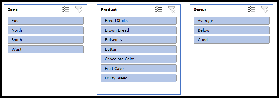
- Select the column that you want to use in the slicer. Here we have selected zone.
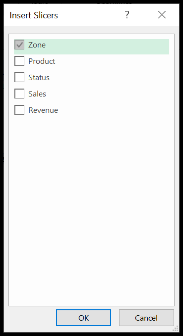
- In the end, click OK. You will have slicer tool enabled for your excel table.
Now lets learn how to use the SLICER tool in Excel. The tutorial is getting more interesting, isn’t it ?
How to use Slicer in Excel ?
Now we will learn how to use the Slicers since we know how to insert one. We will discuss three important things now.
1. Select a Single Slicer item
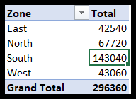
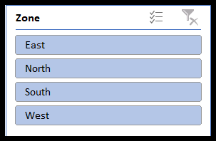
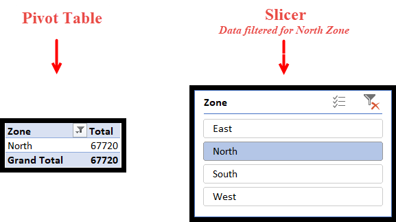
This is quite simple. As soon as you insert a slicer, you click on any button to filter your data. Let’s try to understand it with a very simple example. Here we have inserted a slicer of Zone. The blue highlighted buttons (East, North, South & West) are all selected. Therefore, you can see the data of all four regions in the pivot.

Now we need to filter our data for the North Zone only. Click on the North button. The data in the pivot table will automatically be filtered. As soon as you click on the north button all the other buttons will be blurred.
2. Select Multiple Adjacent Items
Now, what if we need to select the data for two or more regions? Let’s say we need to filter the data for the East and West Zone. This is very easy. You just need to press Ctrl and click on the buttons you need to filter.
Like here we will press Ctrl and click on East & West.
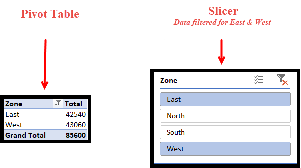
You can also select two or more consecutive buttons by simply clicking and dragging. Here we could have used this method if we had to select the data for East & North, or North Or South or South & West.
3. Clear Selected Items
The last and most important thing is removing the filters. Once you remove all the filters, all of your data will be visible and all the buttons will be highlighted. You can do this with a single click on the top right button of the slicer.
Formatting a SLICER in Excel
Since now we know how to work with slicers, let us start with formatting.
When it comes to useful presentable reports, format plays an important role. A well-organized, eye-catching, and good-looking report will attract more audiences than others. So, it is crucial to organize and format the reports and Slicers.
1. Remove Headers
Many times, we run short of space in our reports, especially when we are making a dashboard. Do not worry if your slicer takes up more space. We can cut it short in many ways, one of which is removing the headers.
Here in our example, we know that North, East, West & South are the Zones, so we don’t necessarily need the Header “Zone”. Let us remove the header and save some space.
Select the Slicer → Right-click → Slicer Settings.

Untick the box against “Display Header”.

The header is removed, and we could save some space.
2. Change the Font
The next thing you need to know is how to change the font of a slicer.
- To start with, select any style in the ribbon that best suits your requirements.
- Now, right-click and click on the duplicate.
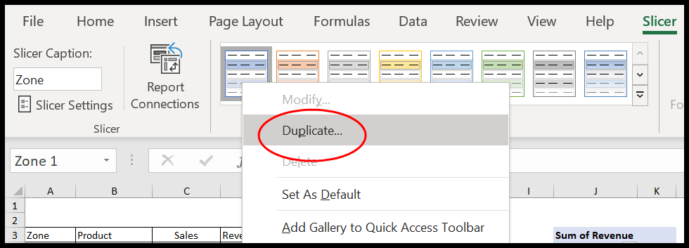
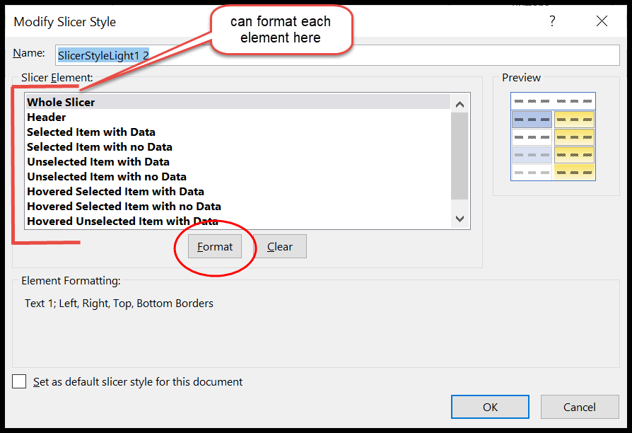
- Here a dialogue box “Slicer Elements” will open.
- In case you missed it, right-click on the duplicate slicer style and click modify.
- Now click on the whole slicer and then Format.

- Customize the font, borders, and fill as per your requirements.
- Hit OK.
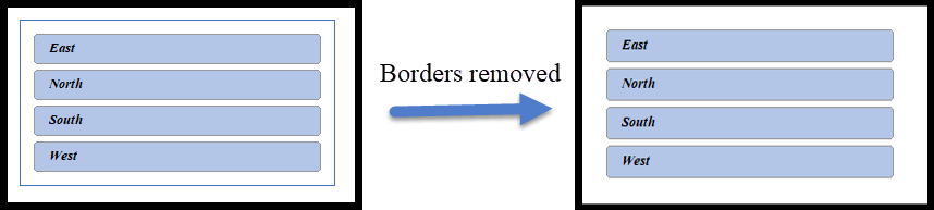
3. Remove Borders
Removing borders is as easy as changing the font. First, repeat the steps you did in changing the font.
- Select the duplicate slicer style → Modify → Format → Border.

- Since we want to remove borders so click on “None”.

- Now hit OK.
4. Remove Items with No Data
Sometimes you might find some items which are not highlighted since they do not contain any data. For here, when I select the product, “Choco” East and South zone are not activated. This means that there are no sales of “Choco” In these two zones.

It is always advised to hide such buttons. Let us see how to do it.
- First, right-click the slicer and select Slicer settings.
- Now you will see the “Slicer settings” window.
- Tick the box against ‘Hide items with no data”.

- Here we go.

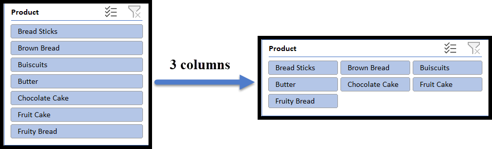
5. Customize Columns and Buttons
Most of the time, the slicer may not fit into your dashboard or report due to its column-type structure. Hold on!! If this is the case, then you need to know that you can organize the distribution of the buttons in a slicer.
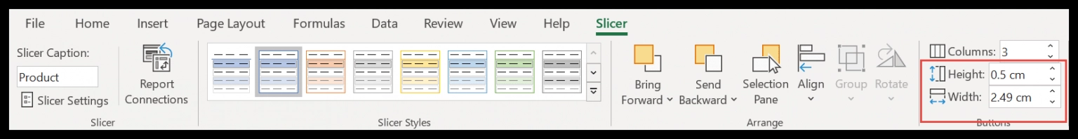
Select the slicer → Slicer (Top Ribbon) →Buttons
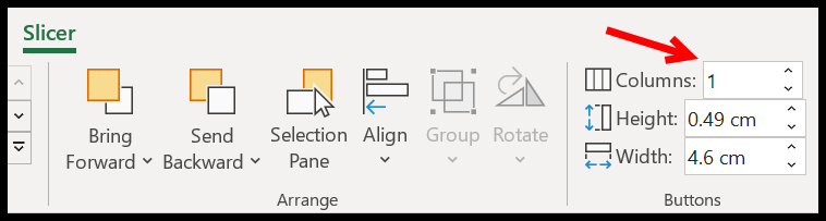
Here, increase the number of columns as per your requirement. I have increased the columns to 3, and my slicer now has three columns and is horizontally spread.
Note: Here, you can also adjust the height and width of the buttons from the same tab.
6. Customize Size
If you do not want to spend more time formatting the buttons or are not interested in playing with the columns and button sizes. All you need to do is adjust the dimensions of the slicer using the Size option.
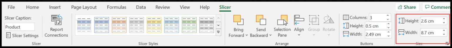
You can also use the mouse, but you need good control over it. To avoid all this mess, simply select the slicer → Slicer (Top Ribbon) → Size. Here you can adjust the height and width of the Slicer as a whole. You do not need to play with each element.
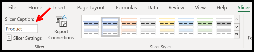
7. Rename a Slicer
What if you want to rename a Slicer or put a small description in your Slicer header?
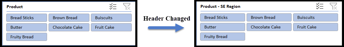
You can do this with a single click. Select the slicer → Slicer (Top Ribbon) → Slicer Caption.
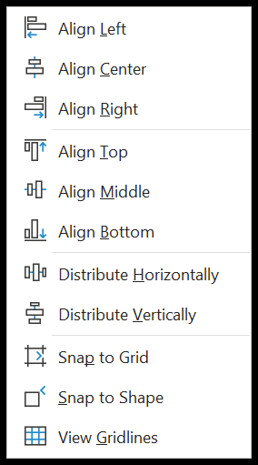
8. Align Slicers
The next important thing that you need to learn is alignment. When you have multiple slicers, it is always advised to align them for a better presentation. Select all the slicers → Slicer (Top Ribbon) → Arrange → Align.
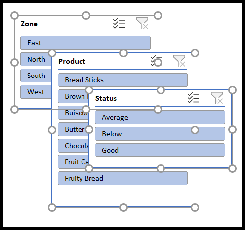
Here you have several options that are useful when you have more than one slicer but more than two slicers. Most of the time when you insert the slicers, they are cascaded over each other.

They are not distributed well. To arrange them well in your report or dashboard we have a quick fix called Align.
Align: This option helps you to arrange all your slicers to the right, top, middle, and bottom of the report. You need to decide where you want to place your slicers.
- First, select all the slicers.
- After that click on Align Top.
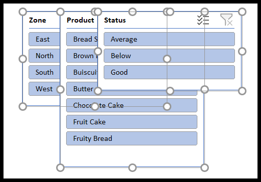
- All the slicers will have a common start point from the top.
- Now select the most right slicer and drag to the right side. Here you need to think of the approximate space all your slicers will be needing.
- Here again, select all the slicers and click on distribute horizontally. Sometimes you might have to click this multiple times to adjust the spaces between the slicers.
Similarly, you can distribute your slicer vertically.
Snap to Grid and Snap to Shape: In case you are running short of time and have multiple shapes In your report or dashboard, all you need to do is select all the slicers and click on Snap to Shape. This will automatically highlight the snap-to-grid option.
- Snap to shape helps you to adjust your shape to the other shapes in your report or dashboard.
- Snap to grid adjusts your slicer or shapes to the columns and rows in your workbook.
Conclusion
In summary, the SLICER tool within Microsoft Excel emerges as a dynamic asset for refining data analysis and optimizing dashboard design. Its user-friendly interface and swift functionality offer a distinct advantage over traditional data filtering techniques, particularly within pivot tables and charts.
With the ability to seamlessly integrate slicers into Excel tables and pivot tables, users can effortlessly navigate and spotlight specific data subsets, all while preserving the core structure of the dataset. The tool’s flexibility in single or multiple item selection, clearing choices, and customized formatting empowers users to present data in a visually appealing and comprehensible manner.
By mastering the SLICER tool‘s diverse functionalities, data analysts can reshape the landscape of data analysis and presentation, ushering in a more intuitive and efficient approach within the Excel environment.