In this blog post, we will discuss about inserting people graph in our excel data set. Furthermore, you will also understand and learn about various customization options to make our People Graph more interesting and visually appealing. This tutorial is applicable for all versions (mostly recent and latest) of Microsoft Excel.
Introduction to People Graph
There is a chart in Excel about which most of us are not aware. That’s called: People Graph.
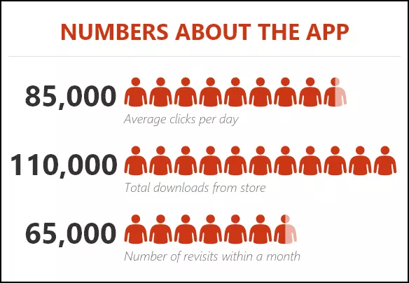
It was first introduced with Microsoft Excel 2013 to help people to create infographics. In a people graph, instead of a column, bar, or line, we have icons to present the data. And, it looks nice and professional.
Today, in this post, I’d like to share simple steps to insert a people graph in Excel and the option which we can use with it. So let’s get started.
Easy Steps to Insert a People Graph in Excel
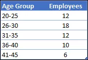
To be honest, creating a people graph in Excel is simple and easy, we just need few clicks. Here is the data table which we are using for this tutorial blog post, you can download it from here to follow along.
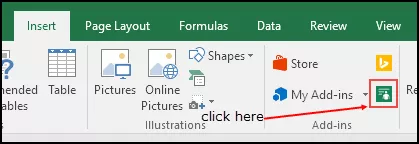
- First of all, go to Insert Tab -> Add-Ins -> click on the small green button.
- It will insert a people graph with dummy data.

- Now, your next step is to connect data with the chart.

- Click on data icon and then click on select your data button.
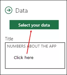
- Now, select the data table and click on create button.
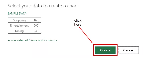
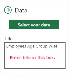
- The last thing is to all a title for your chart.
- Again click on the data icon and change the default title to the desired title.
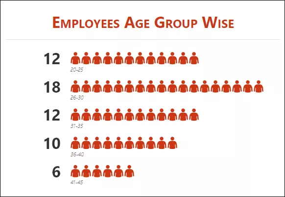
Congratulations! Your first info-graphic People Graph is ready to tell its story. It’s a proud moment, take a break.
Customization and Other Options
As I said it’s easy to insert a people graph. But, there are some customization options that can do after that.
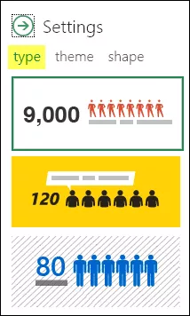
1. Chart Type
There are 3 pre-defined charts types that we can use. Click on the setting button and select the type which you want.
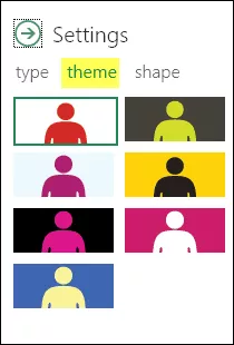
2. Theme
We can also use different themes for our chart. There are 7 pre-defined themes that we can use. Click on the setting button and select the type which you want.
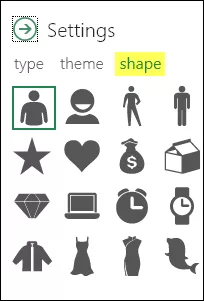
3. Shape (Icon)
We can’t use a single shape for all types of data. So that’s why there are 12 different shapes from which we can select. Click on the setting button and select the shape which you want.
4. Save as Image
There is an option to save it as an image. With this, we can use it further in PowerPoint, send it in an email, upload it to the web, etc.
5. More details
- When you update any value in the source data, make sure to click on the graph once to update it.
- You can also paste it as an image in the worksheet by copy paste.
Final Conclusion
Infographics like People Graph are superb in presenting data in a vivid way. And we believe that creating a people graph in Excel is really fun. You can also use it in your dashboards and templates to give them an awesome look and for an effective way to make others understand data.


